ShopDreamUp AI ArtDreamUp
Deviation Actions


Suggested Deviants


Suggested Collections


You Might Like…


Featured in Groups


Description
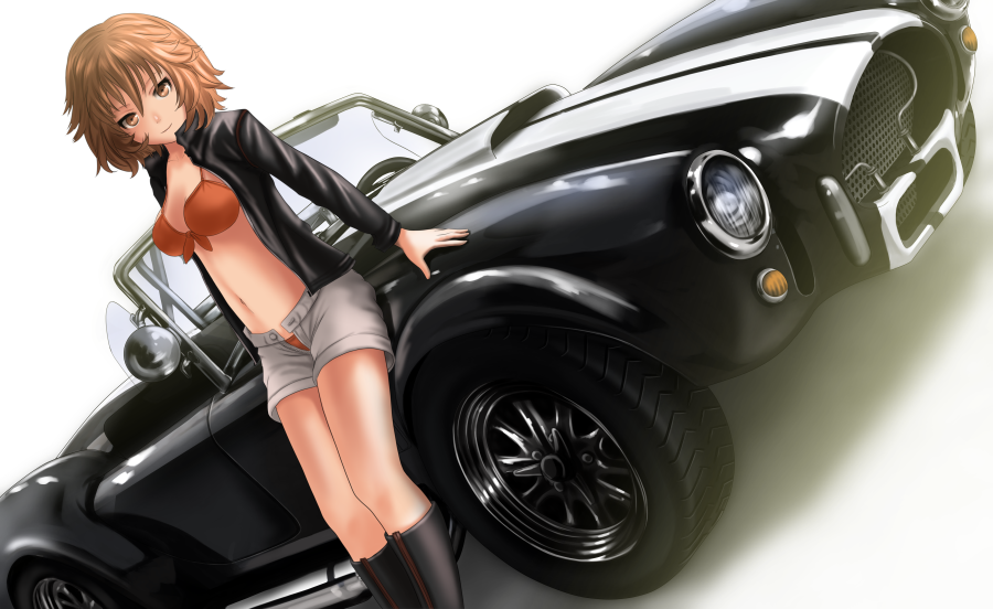
Take some days until i figure how paint the reflections but here it is. This is the final result, i only change some parts in the front... also... probably the wheel is not so accurate --U....
Thanks for all you guys that vote in the pool! also for the people that vote for little bastard, probably i will draw that car soonly (i dont know when yet XD).
The character is Oxy from my project Nevermore.
--------------------------------------------------------------
Other recent works:
:origin()/pre02/d535/th/pre/f/2017/148/1/3/alexia_by_s0mnialuc1d0-dbaqg7o.jpg)
:origin()/pre12/f7f2/th/pre/f/2017/147/a/5/vesp1_by_s0mnialuc1d0-dbal8bf.png)
:origin()/pre07/456f/th/pre/f/2017/143/3/3/messerschmitt_by_s0mnialuc1d0-dba5qor.png)
:origin()/pre10/a738/th/pre/f/2017/141/e/c/over_there_by_s0mnialuc1d0-db9ydkx.png)
Nevermore©
my pixiv: pixiv.me/kein912
Thanks for all you guys that vote in the pool! also for the people that vote for little bastard, probably i will draw that car soonly (i dont know when yet XD).
The character is Oxy from my project Nevermore.
--------------------------------------------------------------
Other recent works:
Nevermore©
my pixiv: pixiv.me/kein912
Image size
900x552px 500.89 KB
© 2017 - 2024 HasegawaKein
Comments38
Join the community to add your comment. Already a deviant? Log In
I like this piece for the following reasons:
1. The glossy metal and headlights of the car look incredible and photo realistic.
2. The character's pose is exactly like a model at a showroom, car convention, and/or for promotional material.
3. The light source seems to be more consistent across all elements whereas in some past works it seemed inconsistent. So this is definitely a sign of improvement.
4. The attention to accuracy of the clothing has improved greatly as well. The wrinkles and shading look much more natural.
With all of that said there are a few areas that could use improvement:
1. While it's difficult to determine exactly what the complete environment looks like, some of the highlights and shadows in the foreground look unnatural or unrealistic particularly the hub caps on the wheel and the torso when compared with her legs.
2. I agree with the other critique already provided in that the angle of the shot is a bit severe and does detract from the overall viewing experience.
3. The colors in the jacket and boots are a bit flat. Black clothing can be tricky in this regard but in most cases there is always a subtle hint of some other color in the lighter areas rather than being pure (unsaturated) gray. And this is not to say I didn't see the red/brown strip of the boots (that's separate from the black parts).
Now I should mention that I was straining to find the third area for improvement because S0mniaLuc1d0 has improved a great deal.
Hope you don't mind the list format. Just faster to get done and might be easier to read and comment on too.